H20: A Hydration App
H20 is an end to end gamified hydration tracking app that allows users to track their hydration intake across various different liquids, all while creating life on an alien planet.
The more users log their hydration to reach their hydration goals, the more they develop their alien planet.
The app provides interesting hydration facts throughout the process to keep users engaged. The intention is to be an app users don’t mind getting notifications from.


-
Creating a user experience that was both educational and delightful.
-
User interviews showed there was a foundation of strong motivations and aspirations to build off of regarding hydration.
-
Speed is your friend in prototyping, testing, and iterating.
Role: UI/ UX Designer; UX Researcher; Interaction Designer
Tools: Figma; Zoom
Year: 2022
Challenge
Make drinking water a fun and informative, maybe even addictive, experience.
Process
Empathy > Define > Design > Prototype > Test > Iterate > Reflect
1. Empathy
Research goal focused on uncovering users hydration practices and beliefs, health and tracking habits, and interest in games to determine whether bridging the two was desirable.
OBJECTIVES
Understand users feelings toward health and hydration
Understand how hydration and games fit into users’ routines
Learn what features people use the most on a hydration or health app and what additional features would be useful
PROCESS
Competitive Analysis
User Interviews
User Persona
Competitive Analysis
I explored five of the most highly reviewed hydration apps on the market to determine how they were engaging users, their strength and weaknesses, and how H20 could fill those gaps moving forward.
TRENDING STRENGTHS
Focused features with visual aids, customized hydration goals / data, ability to sync with Apple Health app and fun incentives to reach goals, clean and pleasant UI.

TRENDING WEAKNESSES
An unappealing and overwhelming combination of pop up ads, paywalls, hectic UI/UX and limited explanations of app / game features.
User Interviews
I recruited five participants to learn about their desires and challenges when it came to water drinking habits, health apps, and what types of games (digital or physical) they liked to play and why. I tried to keep the questions open-ended to leave room for their behavioral patterns and core beliefs.
Method: combo of in person and remote via Zoom
Participants: 5
Age: 23 - 35
FINDINGS
Users are aspirational about staying hydrated, and were interested in a convenient reminder system that didn’t feel like an additional task to their day
Users recognize that there may be other liquids they drink more than water itself
Users prefer games that are social, visually stimulating, quick and challenging yet doable
Users aren’t particularly knowledgeable about hydration and want to gain relevant information to help stay motivated

User Persona
To have a clear understanding of H20 users, I distilled the researching findings and interviews into a user persona to guide design decisions - meet Dalia.

2. Define
PROJECT GOALS
Defining the project goals by strategizing how to align the user’s goals with business goals helped guide how to best resolve the user’s different pain points and problems.

FEATURE ROADMAP
I used a feature roadmap to determine the most high priority features and solutions need for the MVP. The lower priority items would be addressed for future product development with more time and resources available.

User Flow
I created the user flow showing the different paths they might take to accomplishing the app’s main tasks. The user flow takes the user from customized onboarding and creating an avatar to hydration logging, planet development and reminders set up. This included milestones, rewards, interesting facts as well as going through the logging history of stats.

3. Design
MID-FI WIREFRAMES
Incorporating findings during the research and empathize phases, I focused on making informed decisions by designing an intuitive, functional, engaging structure and flow.

STYLE TILE
Taking inspiration from health and hydration apps and early RPG games, we created a fun and clean UI. The name and logo are a play on H2O / UFO. I picked a palate that was bold and would work on dark backgrounds since it would be on dark form to be more in line with the concept of space. Since there would be so much color visually to look at and there are text heavy parts of the app, I kept the font simple, easy to read, but on brand.

Initial Prototype
DESIGN DECISIONS
With the flow and visual identity worked out, I created a high fidelity initial prototype for testing. The priority was to present the key screens of a practical, visually and psychologically stimulating app for testing.
*Skip ahead to view final prototype on FIGMA here*


Home screen that shows user hydration level and goals with percentage, liquid measurement, and background water level

Tracking more than water as users often drink different liquids throughout the day

Custom avatar to help user identify and buy into the game dynamics of stewarding Planet H2O

Liquids offer percentage of H2O stat since they have different levels of hydration IRL

Bespoke hydration recommendations based on user health stats

Users are rewarded with hydration factoids along the way

Adjustable reminders so users can feel in charge of their own hydration journey

As users hydrate and log, their planet will populate with more and more life
4. Test
I had the five users who I interviewed in the research phase run through the full user flow for onboarding the game, creating an avatar, logging a drink, reaching milestones and gaining rewards, learning hydration facts, setting reminders, and exploring key pages such as settings and stats.
Method: combo of in-person, remote and moderated usability testing
Participants: 5
Age: 23-35
Task Completion Rate: 100%
100 PERCENT OF USERS
Completed all task flows
Enjoyed the avatar / game concept
Liked the factoids about hydration
Felt there was too much text during onboarding
Wanted visual aids for metrics/logging
75 PERCENT OF USERS
Thought the UI was “cool”
Felt app would help them track hydration
Liked knowing the hydration percentage of different beverages
Wanted more game elements
50 PERCENT OF USERS
Enjoyed being able to share results
Were confused about whether they were hydrating the avatar or the planet
Wanted tracking process to be visually clearer
Felt home screen tracker with only numbers was confusing

Split initial onboarding body text across two screens to help user digest info in smaller increments

Added glass count estimate and visual aid for liquids

Clarified daily hydration goals on home screen with text description under percentage

Moved home icon to navigation and share icon to stats history page

Water level moves with alien head slider when logging liquids to add visual literacy

Replaced “water” with “H20” in body texts to avoid confusion

5. Iterate
FINAL PROTOTPE
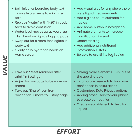
Based on the value vs. effort analysis from user testing, I prioritized making the following final UX/UI revisions for the final prototype.
6. Reflect
Once faced with the task of prioritizing hydration, users quickly realized that it was a habit they needed help maintaining. I tried to make a tedious task more delightful with a bit of gamification. Overall users enjoyed the concept.
Challenges + Future Iterations
Onboarding users to a game and providing them clear instructions, metrics, and helpful facts while keeping the text minimal and engaging was challenging. Another challenge was offering a balanced amount of liquid logging options without overwhelming the user. I learned to minimize confusion by using simple and consistent language with visual aids. With more time, I would like to engage users more by...
Animating the alien and planet elements for visual interest
Incorporating additional hydration facts and nutritional stats (sugar, calories, etc)
Gamifying the app further by allowing users to invite friends to planet, experience milestones together, and create competition
Next Steps
Re-test revised prototype
Hand off to team for implementation
Launch new product
Assess impact, update priorities and add new features